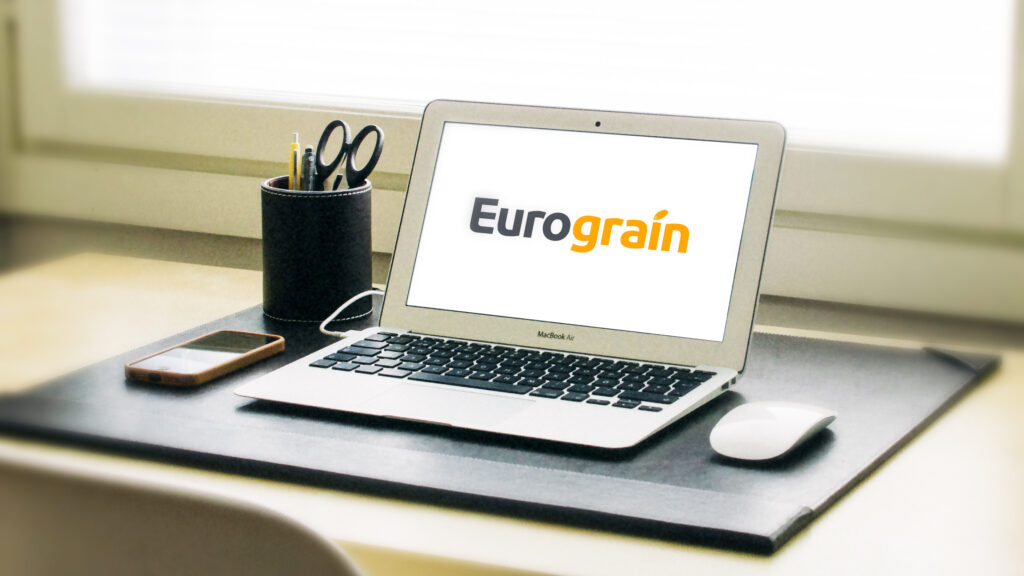
On the occasion of the website redesign, the question of Eurograin's visual identity, logo, colors and brand signature arose. After several stages of research and discussion, it was an evolution of the existing (rather than a complete redesign) that was decided by Nicolas Perrachon and Vincent Midy. Thus, the two colors of the logo, orange-yellow and dark gray, which are both significant (yellow for grain and gray for steel) and well associated with the brand, are retained. The typography is modernized and bolded to provide stability and readability. The grain pattern that adorned the "i" in the old logo is simplified and stylized.

The brand signature becomes "Builder of silos and agro-industrial buildings designed to stand the test of time," which links the brand to the company's trade while highlighting the reliability and durability specific to "sheet pile" type square silos, Eurograin's industrial signature.
Eurograin's visual identity had to correspond to the company's new ambition without denying any of its fundamentals.
Nicolas Perrachon
This evolution was implemented from October, both in press publications and on social networks as well as on the Eurograin stand at the Grain & Milling Expo in Casablanca.

